Physical Address
304 North Cardinal St.
Dorchester Center, MA 02124

Church branding may seem like the least important part of spreading the gospel. In reality, building an identity allows your message to reach more people.
Unlike a business, a church isn’t primarily selling a product. People choose a congregation for its unique approach to faith and community. New members want to feel welcome and uplifted when they walk through your doors. Since the goal is outreach, your brand should communicate why your environment is the right place for spiritual support.
Creating a church logo is a great way to grab attention online and offline. Symbols boost recognition and offer a preview of your values and vision as a church. Simply put, a strong logo is both empowering to your flock and a rallying emblem for newcomers. If you aren’t sure where to start, follow these tips for church logo design inspiration.
Every church has a mission, and it determines where you focus your efforts. What are the founding principles of your church? What ideals do you hope to instill in your members? How do you put your faith into action?

Take a look at the logo for Crossway Church of Putnam, Connecticut. The logo is two interlocking links forming a cross. It ties in with the core value that Bible doctrine is the highest authority, and following its teachings brings you closer to God.
While it’s tempting to have a broad vision, it’s easier to draw people in when your visuals align with their beliefs. Try to sum up your church’s mission with simple words and phrases. Use these words to brainstorm images that convey what you stand for.
Symbolism is at the root of Christianity, and it should play a role in your church logo. One option is to choose symbols that instantly identify you as a church, not a typical business. Icons evoke powerful feelings, especially when they’re deeply connected to a person’s family, lifestyle, or culture. No doubt, you picture the cross or a crown of thorns when you think about sacrifice. Doves remind you of peace, and an ichthys taps into your belief in miracles.
At the same time, you can avoid a cliche logo when you choose less common symbols. Use your church name as a guide, and do a broader search for symbols related to these words. Just make sure they don’t conflict with your message.
Worried about making a design that’s too obvious and overdone? Study up on current design principles to update traditional church symbols. Beliefs have incredible staying power, but they evolve with your goals as a ministry. Channel this spirit of reinvention to create a symbol that’s both unique and recognizable.

Consider the dove and cross church logo of Calvary Temple Ministries based in Sterling, Virginia. The logo has a monochomatic color palette with lots of negative space. Minimalist lines and shapes evoke a sense of lightness and renewal. Not to mention, the youthful unfinished lines make the design friendly and modern.

If you’re using common symbols, try tweaking the texture, pattern, shape, or color in a surprising way. On the flipside, you can apply a common treatment to a unique symbol. St. Mark’s Episcopal Church of Lincoln, Nebraska, had a winning logo concept with its stained glass lion.
Can’t decide between that sword and shield, crown of thorns, praying hands, and mountaintop? Do yourself a favor, and resist the urge to slap it all together. Some of the worst church logos fail because they’re overloaded with ideas.
There’s no need to capture the complete history of your church in a simple logo. Instead, zero in on the core ideas and feelings you want to share with others.
It helps to concentrate on the emotions you hope to provoke. Do you want to convey a sense of belonging? Fellowship? Goodwill? Tradition? Sacrifice? Diversity? Salvation? Know what defines your church, so you can remove elements that distract from your central message.
People are the heart of a congregation, so member expectations should factor into your design plan. While you may welcome everyone into the fold, current members may share common traits. Maybe, you attract a large youth audience or serve culturally diverse areas. You may have a traditionalist vibe or work with reformed addicts and convicts.
Speak to members about what matters to them and how they define their church experiences. Their insights could spark ideas about how to translate your church brand into a dynamic image.
Make sure your font matches the overall tone of the design. Serif fonts complement many traditionally styled designs, creating a look of heritage and antiquity. Sans serif fonts are often better suited for minimalist and geometric logos. You can be even more flexible with a youth ministry, using playful fonts that relate to your target members.
Creative typography adds a “wow” factor to a basic image. Brainstorm ways to make your church name interact with logo symbols.

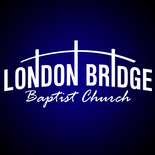
For example, the logo for London Bridge Baptist Church of Virginia Beach, Virginia, features letters intersecting with an arc to form a bridge.
Using multiple fonts, sizes, or line weights is another attractive technique. However, you don’t want to go overboard with clashing elements. So change one thing at a time. For instance, vary the line weights on adjacent words or reduce the font size on each line. Minor variations can add contrast, producing a more balanced design.
Bigger ministries have more sub-brands to think about. In the future, you may decide to create logo variations for your individual outreach programs or sermon series. It’s easier to extend your visual branding if the original logo is simple and flexible. With this in mind, choose a logo that makes it easy for you to add or remove elements without losing brand recognition.
A consistent visual story brings clarity to your church’s message. You can’t predict where and when community members will come in contact with your church logo. But you can plant the seeds of curiosity in their minds. When you understand what fuels spirituality, you can design brand visuals that touch a person’s heart.
Need some church logo ideas? Browse hundreds of options in our logo maker tool.