Physical Address
304 North Cardinal St.
Dorchester Center, MA 02124
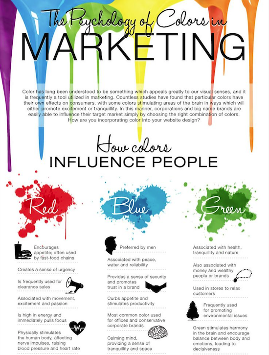
No doubt you’ve seen one of the dozens of infographics floating around the Internet that shows the meanings of the colors. Green means natural (or money). Black means luxury (or death). And so on.
In fact, you’ve almost certainly seen more than one. We found about 15 in just three minutes on Pinterest. Stuff like these three examples:
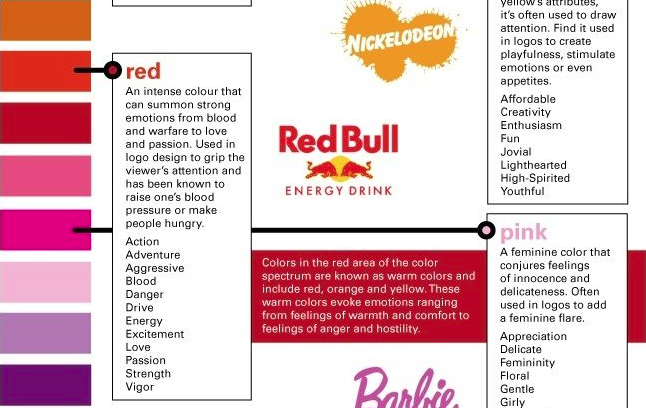
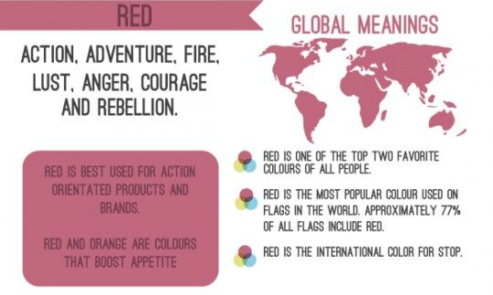
It’s interesting information.
And it’s probably completely wrong.
Take this example: almost all of these infographics talk about how the color red “encourages appetite” and that’s why it’s used in the logos of so many restaurant chains.
Just don’t tell the restaurants that don’t use red in their logos, like Subway, the second largest chain restaurant in the US. Or Starbucks (#3). Or Taco Bell (#6). Or Dunkin’ Donuts (#7). Or Applebee’s (#10).
But they don’t need to worry. Because the whole “red stimulates the appetite” is very likely not true.
It’s not just infographics. We found similar claims on The New York Times website. And CNN. And Huffington. Heck, we’ve written about it ourselves.
We can already hear you saying, “What? But those infographics have foot notes!” Or, “If it’s in The New York Times and the Logomaker blog…”
Yeah, about that.
We spent two days looking for any kind of scientific research to back up the claim that the color red stimulates appetite.
It’s just not there. Not on Google Scholar. And not at PubMed. No where.
Sure, there are hundreds of thousands of webpages that make that claim. But most of them don’t link to any imperial data or research, and those that try, link to other webpages making the same unsupported claim. A couple of the best researched pages quote marketing books from the 80s to back them up. But those books? Yeah, we weren’t able to find any citations from research there either. Just the kind of “experts say” stuff you get from writers who don’t do their homework.
Actually, there was one exception.
This study says the color red does stimulate feeding.
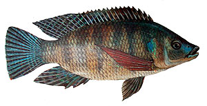 In Nile Tilapia fish.
Interestingly, the fish study also says that the color red stimulates appetite in humans and attributes that to a paper written by S. Singh. But that paper found here is a dead end. It makes the claim, but doesn’t back it up. No research, no links to research. Nothing.
In fact, there is some scientific research that indicates the opposite: red may actually inhibit feeding in humans.
Check out this study (from the publication, Appetite, which probably knows a thing or two about eating) that found research participants who were served a drink in a red cup consumed less than people served a drink in a blue or white cup. They also ate less snack food when served on a red plate than on a blue or white plate.
How can that be if red stimulates appetite?
This isn’t the only thing scientists have learned about the color red and human behavior.
In another study, participants who were given a choice between a pen shown against a red background and the same pen shown against a blue background. People had a more positive attitude toward buying the pen shown with blue. Not red.
In a more disturbing study, job candidates wearing red were thought to be less intelligent than candidates wearing green. A follow-up found that job candidates wearing red ties (as opposed to blue) were thought to have less leadership ability. (Metal note: give my red ties to goodwill).
Taken together, these studies seem to indicate that the color red has an inhibiting effect on human behavior in general. You know, kind of like a stop sign.
So What Does This Tell Us About Color and Logo Design?
Absolutely nothing.
Taking about color outside of the context that the color is used is practically useless. There is a huge difference between how a person responds to a red car, a red dress, a red sign, and a red logo. Color psychology and response is entirely dependent on the context a color is used in.
Take a look at several red logos: Avis. Target. Levis.

Does seeing those make you hungry? Of course not. Because you probably don’t connect these logos to situations where you consume food.
But these red logos might make you crave something: Coke. KFC. Dairy Queen. Heinz.

The difference is that you encounter these logos in situations where food is consumed. If you’ve had a positive experience with these brands, they may trigger an “I’d love a blizzard and fries right about now” kind of response. But it has very little to do with the color red.
Color meaning is situational.
Seeing a brand new red restaurant logo isn’t likely to make you hungry (at least until you connect it to a positive eating experience). And it probably won’t raise your heart rate. But it might catch your attention—especially if the red stands out from the surrounding environment. That’s what red does best.
So you can probably forget those color psychology posters and recommendations. Including ours. When it comes to color, a lot of what’s said is conjecture or just plain wrong.