Physical Address
304 North Cardinal St.
Dorchester Center, MA 02124

It’s Friday (thank, goodness) and that means it’s time for another round up of the week’s logo design news. Anglophiles take heart—lots of announcements from across the pond. Here’s what caught our eye over the past seven days:
![]() This week we start off with the logo for a new location-based app called Highlight that tells you when people you know or people with similar interests are nearby, so you can connect. Some users are reporting it’s the hot thing at SXSW this year. But Business Insider says their logo may be the worst ever. What do you think? Yeah, it might induce a headache or two.
This week we start off with the logo for a new location-based app called Highlight that tells you when people you know or people with similar interests are nearby, so you can connect. Some users are reporting it’s the hot thing at SXSW this year. But Business Insider says their logo may be the worst ever. What do you think? Yeah, it might induce a headache or two.
A few weeks ago we pointed you to a video of a 5-year-old describing a set of logos. This week there’s a British version making the rounds. Do kids sound cuter with an accent? Here’s the original for comparison (which has been watched more than a million times).
 Last week we saw a new logo for the USA Olympic basketball team. This week the US Speedskating team unveiled it’s new look. The “S” is for speed, or skating, or success, or something. We’re looking forward to seeing them skate at the next Winter Olympics.
What happens when your city commissions a new logo only to discover at the last minute that it resembles a 11 year-old logo used by neighboring St. Petersburg Pier? West Palm beach is about to find out.
 Boston-based Grant Marketing created a new logo for the Massachusetts General Hospital’s Center for Law, Brain and Behavior. Holy cow, that’s a lot of words to get into a logo. With so much stuff to fit in, they did a pretty nice job. What do you think of the design?
We saw logos pop up in a lot of unexpected places this week. There’s a Rey Mysterio logo on this 5 year-old’s prothetic leg and he loves it. This man wants a deer head tattooed on his molar (sports logos are also popular). How about logos as interior design (this one is made up of game icons and looks pretty cool). Lastly, game company China Joy created their new logo out of ice, then poured red wine on it. Apparently this is a popular PR stunt in China.
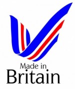
 Britain’s Labor Leader, Ed Miliband is throwing his weight behind using the Made in Britain logo that was designed last year to help citizens understand where the products they consume come from. From the article, we learn that HP sauce (is anything more British than this?) isn’t made in Great Britain anymore. Bollocks! Next, they’ll be telling us the Queen is of German, not English, decent.
This is pretty cool: the new station identifiers used by Animal Planet to display their logo between programs. Of course, in the US that’s valuable advertising time, so we’re not likely to see them, except at the link. Which do you like better, bears or penguins?
 Glasswells unveiled a new look based on its first shop sign way back in 1946. That makes 5 British logo news items in a row. So let’s break the streak with this announcement of a new logo for Miramar Group’s Mira Moon hotel in Wanchai.
 Did you know that when Salvador Dali wasn’t painting melting clocks and heads propped up on stilts, he was creating logos? News to us too. But he did. For iconic Catalan lollipop maker Chupa Chups. Apparently, he was friends with the candy maker’s owner. We love stuff like this.
Coming toward the end of our update we find this news item: the District of Sechelt spent $20,000 on a new logo and tagline, only to decide, now the logo is in use, that it’s not representative of the community. Ouch. Worse, the new tagline, “Naturally Spirited” is used by a company that markets cocktails. Someone didn’t do their research. Now, where could Sechelt have gone to get a logo and save about $19,950? Hey, guys, there’s still time.
 And this week’s Google logo re-draw (often called a Google Doodle) was to celebrate International Women’s Day. Seems like a good one to end with.
Did we miss anything? Let us know in the comments.