Physical Address
304 North Cardinal St.
Dorchester Center, MA 02124

Creating a consistent look for your brand is one of the most important reasons to design a logo. Yet, consistency isn’t something that happens automatically once you create a logo.
Graphic images have complex properties that depend on the right formatting to look clean and professional. An image that looks attractive on your website could turn out murky and distorted on a sign or promotional pen.
To avoid problems down the road, consider how and where you intend to use your logo. Making good decisions early in the design process will help you get a finished product that works well for online and offline promotion.
Simplicity isn’t just a minimalist trend. Paring down your logo design makes sense in small business because it will be easier and cheaper to print.
Keep in mind, print media usually requires a bigger investment while allowing less changeability.
In digital media, you can quickly replace a logo on your website and social media pages at no cost. Print media is less flexible in this regard.
You don’t want to print your logo on 100 mugs and then be forced to reprint when someone notices a typo. If you have fewer elements in your design, there will be fewer ways it can go wrong. FreeLogoServices has a few helpful tips on how you can create a minimalist logo design.
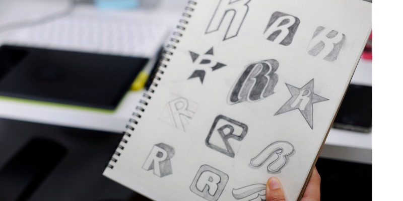
Working on early drafts in black and white or grayscale is a technique pros use to perfect the forms in a logo. Adding color right away can make it harder to see errors or small elements that are out of balance.
Once you blow up your logo for a poster or T-shirt, glaring mistakes will be hard to miss. Even if you decide to make a color logo, create a black-and-white logo as an alternate version.
That way, you have the option to print your logo in black and white for flyers and newspapers, instead of spending more on color graphics.
Poor scalability is one of the worst problems that can ruin an otherwise great logo. Basically, you should be able to resize your image up or down without losing clarity.
If you try to create a logo in a low-end graphics program, you will lose resolution the more you alter the size.
Using a professional vector graphics program is the best way to create an adaptable design.
Vectors rely on mathematic equations to plot out points, curves, and lines that make up your images. You can scale a vector to any size and save the file with a transparent background.
Transparency allows you to place your design over other backgrounds, allowing relevant areas to show through.
Most professional printers will ask for vectors, so they can adjust the files as needed to get the best results. In digital applications, vector source files make it easy to update or resize your logo for different sites.
Social media pages all have individual sizing standards for icons and banners. Although you’ll most likely use bitmap graphics for these sites, you can convert vectors to get any other type of image file you need.
Depending on where you use your logo, you may have to simplify your design from time to time. Some logos lose too much visibility in small formats, such as favicons, app icons, and social media icons.
Instead of trying to squeeze a detailed logo design into a tiny box, make a condensed version that is just as recognizable.
Fortunately, vector graphics programs allow you to create a design in layers. Take advantage of this feature to separate text and graphics.
You want it to be easy to display a standalone logomark or wordmark when the full design is too cumbersome. In many cases, you may be able to keep both elements by changing the position of text. In either scenario, working on these elements separately will give you the most flexibility in the long run.
Sure, it’s easy to get caught up trying out fancy effects in a logo design program. The next thing you know, you have an embossed 3D logo with glitter and drop shadows. Don’t assume it’s a good idea to pile on visual effects just because they’re available to you.
Again, less is more. Some effects are terribly outdated and will not translate to other types of media, which weakens the consistency of your brand. Not to mention, adding too many elements makes your design look less professional.
Make sure you keep track of the correct color codes for your logo files. Web applications typically use RGB codes.
In this system, all colors are derived by mixing values of red, green, and blue. This model is known as “additive color” because values are added to achieve the final hue.
Print media relies on CYMK codes, which are derived from cyan, yellow, magenta, and black. The CYMK mode uses “subtractive color.”
In this model, you begin with a combination of all colors and remove values to get new colors. Although professional printers and designers have ways of approximating the color, you can make everyone’s job easier by providing the correct codes from the start.
Embrace every opportunity to get free and wide exposure for your business. If your ultimate goal is to expand, protect your logo design with a brand guide.
A brand guide tells others the exact specifications to use when reprinting your logo. This is the smartest way to achieve consistency and avoid subtle differences in proportion, scale, and color.
Posting a guide on your site also encourages people to use your branding in local or online media. Over time, your logo will become synonymous with your brand and help to forge connections with your audience.
Ready to make a logo for your business? With the tips above in mind, get started on your new logo!