Physical Address
304 North Cardinal St.
Dorchester Center, MA 02124
A professional logo design brings an extra level of credibility to a construction brand. People look to your construction company for expert help with big projects that influence their everyday comfort. If you want customers to reach out to your business, create a logo that inspires confidence the moment people see it.
Whether you work with consumers or businesses, a construction company has a lot to prove. You’re asking clients to trust you with costly projects that could cause a lot of stress if they go wrong. Having a strong brand and construction logo sends the right message from the start. You run a serious business, and you care about quality.
Competition is stiff among contractors, and a memorable brandmark gives you an advantage over other companies. Design a logo that highlights your strengths and motivates people to call your business.
Understand one thing before you do any brainstorming. Your brand positioning should inform your logo design, not the other way around. Your brand comes from the tangible and intangible qualities that define your business model and the customer experience you deliver. Your brand has meaning and influence without a logo. But a logo without a well-defined brand is just a humdrum piece of art.
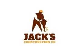
Figure out what space you fill in the market, and use those details to shape the criteria for your logo.
Answering these questions will help you narrow your focus and choose the right aesthetic to convey your message. Use your notes to create a design brief, so you have criteria to guide your decisions.
Look at what other brands are doing to see what does or doesn’t work. For starters, you don’t want to make a logo that’s too similar to your competitors. Whether your logo is a tiny icon on a website or racing by on a moving van, customers should be able to recognize it as your brandmark.
You should also avoid imagery that’s so generic it lacks meaning for your brand. A quick online search is all it takes to spot common motifs that are frequently overused without interpretation. How many times have you seen rooftops and skyscrapers in construction logo designs? While it’s okay to get logo inspiration from familiar images, it’s important to personalize the design to distinguish your business.

Gather a few reference construction logos you find interesting. How do these logos add context to the brand name? What grabbed your attention about the designs? What elements make each logo memorable? For example, the white space arm and hammer in the logo below instantly draws your eyes. In most cases, subtle design choices transform a simple logo into something special.
Once your design mojo is fired up, start translating your ideas into a visual concept. A great logo sparks recognition in seconds by 1) expressing your brand personality and 2) identifying your industry. Use your brand values and qualities to choose symbols, fonts, and colors that fit your business.
Construction projects make you think of precision, stability, economic growth, and improvement. Since this industry is all about structure and form, geometric designs naturally work well in construction logos. With this in mind, brainstorm objects or symbols to try out in your design. For example:
If you specialize in a subcontracting field, such as roofing, masonry, or pipefitting, you can be even more specific with imagery. Pipes. Paint cans. Lightbulbs. Protractors. Road construction signs. The possibilities are endless.
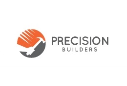
Think about how you can take a basic concept a step further to create a unique look. Can you make the objects and text interact in an exciting way?
Your business name is your most significant source of inspiration. Try to make a clear connection between the words and imagery, so your logo is easier to remember. Let’s say your name is Assurance Building Supply. Right away, the word “assurance” makes you think of strength, confidence, and protection, which pairs perfectly with a shield symbol.
The typography in your logo design has to match the tone of the artwork. And if you’re going with a solo wordmark, it’s even more important to choose a font that captures the spirit of your brand. Heavyweight, sans-serif fonts are a popular choice for construction logos. The bold, sleek lettering sums up many of the qualities we associate with buildings — tough, sturdy, and imposing.
On the other hand, serif fonts have an authentic quality that ties in with timeless, traditional values. Trust and reliability. Time-honored expertise. Attention to detail. Personable service. Try both serif and sans serif styles to figure out what complements your concept the best.
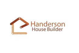
Play around with capitalization and layouts as well. You can add impact to a design by varying the height, width, and spacing of different words or letters. Try typing your business name out horizontally or stacking the words. The layout should feel balanced, attractive to the eyes, and easy to read.
Color defines your brandmark more than any other element because it appeals to our senses. Customers will remember the colors in your logo even if the other details are murky. Choose a color scheme that stands out well on print media. Networking and promotional advertising are crucial in the construction industry since clients often see your branding on vehicles, uniforms, and local signs.
A simpler design with high contrast will have the highest recall, so don’t overdo it with excessive detail. Select one or two colors that represent the brand story you outlined. Bright colors offer a great opportunity for differentiation.
Imagine passing a residential construction site and seeing a sign for Liberty Pro Painters. Would the sign be as memorable in black and gray? Of course not. The red and blue color scheme embodies the American ideal of liberty and patriotism. The colors act as a memory shortcut, so you can effectively recall the brand.
When you’re ready to bring your design to life, there are a variety of ways to make a logo. You can give your design brief and concept art to a designer. You can also post your information on a crowdsourcing site and allow artists to submit proposals. Another option is to use graphic editing software and create a logo on your own from start to finish.
One of the easiest methods is to use an online logo maker. A logo maker website allows you to customize a template to produce a readymade design in minutes. Now you’re probably thinking, why not skip the brainstorming process altogether and go straight to a logo maker?
Developing a concept step by step helps you create a more unique design. You can let the logo maker generate suggestions based on your criteria or manually search for imagery. The latter option is a smart way to choose symbols that are less common in your industry and make them your own.
Whatever method you prefer, make sure you truly love the design before you finalize it. A fantastic logo design should unify your brand and make you proud to promote your business.