Physical Address
304 North Cardinal St.
Dorchester Center, MA 02124
Last week we noted that aside from your business name and the products you offer, the colors you choose for your logo may be the most important choice you make. Why? Because the colors your business uses in your logo, website, and other marketing materials communicate specific things about your brand. Want to subtlety let your customers know you’re trustworthy? Try a dark blue. Want to stimulate your client’s appetite? You may want to use a bright red.
Last week we gave you the low down on blue, red, green, and black. Here are a few more popular colors and what they can represent when you use them in your logo design.
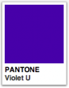 Violet
Purple is a complex color and the hardest for the eye to discriminate. Its meaning differs dramatically around the world. In some cultures, purple is the color of mourning and cruelty. In western cultures, violet represents royalty and magic. Purple logo designs can also communicate intelligence, creativity, intimacy, union, enchantment, and bravery (think purple heart). Red purples get attention more easily than blue purples.
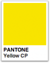 Yellow
Like red, yellow can grab your attention (though a bit more subtly than red does). It can elevate the pulse and signal danger, but it’s also the color of happiness, warmth, riches (gold) and a lack on inhibition. It’s the very first color that the eye processes so, at least in its brighter hues, is easy to see. But yellow has negative connotations as well: cowardice, dishonesty, and caution. Paired with black it represents a hazard. Learn whether or not you should use a yellow logo.
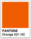 Orange
For most people, orange is their least favorite color. Like red and yellow, it attracts the eye’s attention and suggests fire, warmth, and energy. Orange is more popular among Latin cultures and younger people. It’s the color of youth, cheerfulness, and the sun. Orange logos can also represent aggression, flamboyance, gaudiness, and danger.
 White
White
White is the color of peace, innocence, and purity. In marketing, white logo designs often used to communicate cleanliness, simplicity, and openness. But it can also represent blandness, surrender, clinical coldness, and sterility. White is a brilliant color and can be hard to look at for long periods of time. Usually white is used with other colors to provide contrast or space. And, of course, the good guy always wears a white hat.
 Pink
Pink
Pink is considered the most cheerful color. In the west, it has a close association with girls, as well as romance, sweets, and femininity. One college football team painted the opposing team’s locker room pink because it has a softening tranquil effect on emotions. On the other hand, pink can be draining, and effeminate, and signal weakness. Pink is a great logo color for the right brands (think Barbie) but a bad choice for those wanting to communicate something other than femininity.
So what ideas do you want to communicate with your logo design? What feelings and associations do you want your customers to think when they see your website or business card? Consider which ideas each color represents, then use them when you create your logo.