Physical Address
304 North Cardinal St.
Dorchester Center, MA 02124

We didn’t see as much logo design news this week as we usually do, despite watching the industry closely. So this week’s edition may be a little shorter than usual. But here’s the stuff that caught our eye in the world of logo design:
![]() Wolff Olins designed a new logo and brand identity for Belkin, the consumer electronics company. The logo is supposed to demonstrate Belkin’s commitment to people-inspired products. We’re guessing the all-lower case lettering is supposed to be more friendly.
Wolff Olins designed a new logo and brand identity for Belkin, the consumer electronics company. The logo is supposed to demonstrate Belkin’s commitment to people-inspired products. We’re guessing the all-lower case lettering is supposed to be more friendly.
Apparently someone thinks that Parliament’s portcullis logo isn’t friendly enough. Since when is government friendly?
More English logo news: Crystal Palace FC is choosing a new logo from six ideas. If you’re a fan, you can vote for your favorite until February 1.
 DC Comics also unveiled a new logo this week, something they’ve done a couple of times in the last ten years or so. Comics fans appear to hate it. And we tend to agree with them that the older shield/swoosh logo is more superhero-esque. But we kind of like the “secret identity” meaning and the tribute to Batman in the use of gotham as the font (Batman fights crime in Gotham City). On the other hand, the peeling sticker concept isn’t exactly original—see the Discovery History logo for example. And the DC Entertainment version of the logo is way out of proportion. Check out this designer’s take on the logo along with a pictorial history of DC’s logos since the beginning.
In the past, we’ve profiled several universities that updated the logo or completely rebranded. Is it worth the effort? Tom Banks takes a stab at the answer.
Think your community isn’t friendly enough? Maybe a new logo will help. Cambridge is paying £1000 to find out. And SUNY Cortland thinks a new logo is just the thing to help you remember not to smoke on campus. We believe in the power of a good logo, but this may be a little too much to expect.
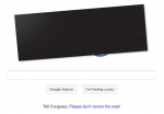
 And for our Google logo of the week, we saw Google join the SOPA/PIPA protests by censoring its logo with a black box. Hopefully a few members of congress saw it as well.
Did we miss anything this week? If so, let us know…