Physical Address
304 North Cardinal St.
Dorchester Center, MA 02124
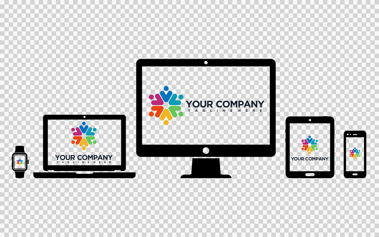
There’s been a lot of buzz about the need for a website that’s responsive, but there doesn’t seem to be enough chatter regarding what happens to one’s logo design when placed on various screen sizes. Joe Harrison, a digital marketing and graphic design agency based in the UK, was the first to experiment with the new concept of responsive logo design.
A responsive logo is a logo whose design elements vary slightly depending on the device or screen size they are displayed on without sacrificing brand identity. The design elements in question could be icons or symbols, business names and slogans, colors, backgrounds, outlines, and other details.
Joe Harrison published a project they had worked on that took globally-recognized logos and changed their appearance based on screen size. The goal was to address the need for brands to adapt to today’s multiple devices and endless screen sizes and resolutions. Basic logo design principles (color, shape, font, space, etc) were used to create multiple variations of the same logo that looked great across a variety of devices.
Globally recognized brands such as Guinness, Coka-Cola, and Kodak have these iconic and often complex logo designs that were difficult to use on social media profiles, mobile phones, and even site icons. As a result, the logos looked warped, unprofessional, and busy. Joe Harrison stripped these complex logos down without sacrificing the company’s brand identities.
“The concept aims to move branding away from fixed, rigid guidelines into a more flexible and contextual system,” they explain on their website.
Whenever you are creating a responsive logo, think about changing these four elements:
Not all responsive logo designs will be the same. Companies with a wordmark logo will have a different responsive design than a company with a combination mark logo (icon and text), badge logo, or image-only logo. Below is how Walmart utilized the idea of a responsive logo design for their combination-style logo.
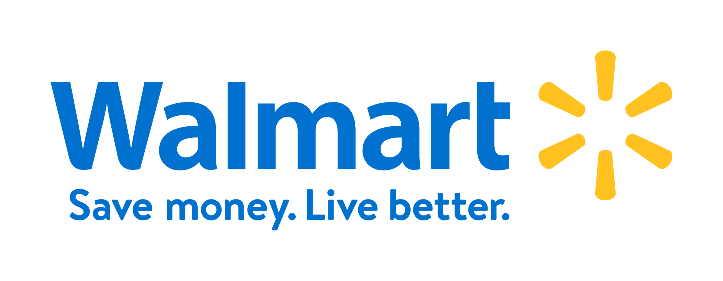
Your full company logo is perfect to place on business letterheads and your website. It’s also ideal to use this logo variation if you are collaborating with another business so that people who haven’t yet been exposed to your brand can help identify your business later.

This is the ideal version for promotional products such as banners, t-shirts, pens, and mugs. The logo is simple enough to be recognizable yet detailed enough to ensure brand recognition. This version is also ideal to include on social media profile cover photos.
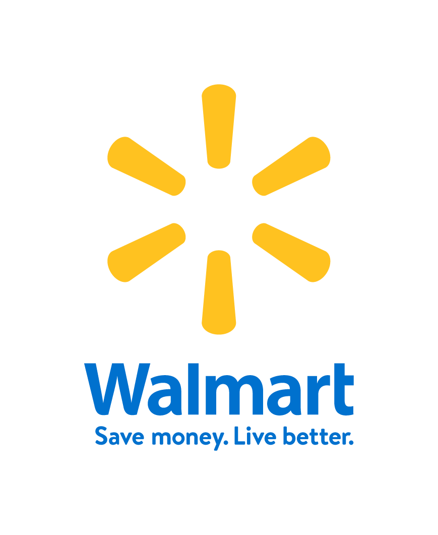
A stacked logo is best used for social media profile pictures, mobile devices, shirt pocket insignias, and smaller promotional products. The stacked logo is best used if you have a combination-style logo design.

If your original logo design is complex but includes a memorable icon, consider isolating your icon to use for a favicon on your website, on your social media profiles, on the mobile version of your website, and on your products. A logo icon such as this one is versatile and scalable.
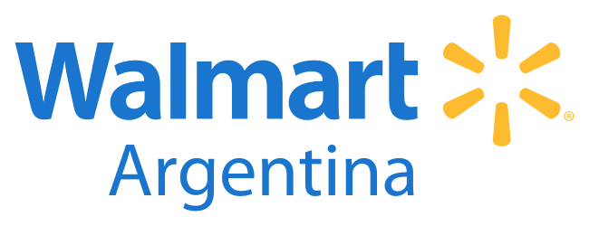

While most businesses will not need to scale their logo this far, here is a great example of a global corporation successfully incorporating geographical regions into their logo design. Walmart has made an effort to create multiple responsive logo designs for their country locations. For small business franchises or for those opening a second or third location, adding the town, city, or street name should be considered.


If your logo has white text or a white background, you may want to use an alternate background color in the event that your promotional products, letterheads and other materials are white. The goal is to always make sure that your logo stands out on a piece of marketing material, whether that be online or offline.


Black and white logo variations are essential to have if you plan on running a print marketing campaign such as fliers, insert mailers, coupons, and newspaper ads. Black and white logos will save your business hundreds of dollars on printing costs.
As you can see above, Walmart’s graphic designers went above and beyond to create dozens of variations of the Fortune 500 company’s original logo. Each variation is meant to meet a very specific expectation and should be used under very specific circumstances. Walmart even goes so far as to explicitly state on their website that no one is allowed to reproduce the logo smaller than 1-1/4″ wide.
Source and additional logo variations: https://www.walmartbrandcenter.com/downloads.aspx
So now that you’ve seen a real-life example of a responsive logo design, let’s work to create one.
First, you will need to create a logo and make sure that you have either a PNG or Vector (EPS) file. The PNG file will ensure that your business logo has a clear background, which will make it easy to edit in a photo editor tool. Vector files are great if you have Photoshop or Indesign as these are high-resolution files that can be easily edited and scaled to fit any screen. We highly recommend you use a Vector file for this project if you have access to Photoshop or Indesign.
However, since the majority of us don’t have Photoshop or Indesign, this How-To will be done using a PNG image file and a free image editor called Pixlr. GIMP, Pixlr, and Fotor are a few of the most popular image editing tools available at the moment.
This whole process should take you about 10-15 minutes – and you will have half a dozen different versions of your business logo! Below are the results of using Pixlr to create a responsive logo design:
Original logo:
Logo without slogan:
Horizontal logo:
Horizontal logo without slogan:
Icon only:
![]()
Black and white:
Grayscale:
Why, yes! We’re glad you asked. At LogoMaker, our professional logo designers will not only make you a logo, but they will also create multiple variations of your logo. Our goal is to ensure that marketing your business is scalable, professional, and able to keep up with current trends – which is why we create responsive logos for those who need them. Request to work with a logo designer and one of our qualified individuals will walk you through the entire process.