Physical Address
304 North Cardinal St.
Dorchester Center, MA 02124
Tech brands can’t overlook the role of great typography in logo design. Modern audiences rapidly devour content with their eyes. Not only does branding have to be unique and relevant; it has to be readable.
Technology has a reputation for making things simple and streamlined. People expect tech logo fonts to capture the same transformative feel with unfussy, nuanced design. But every few years, tech designers latch onto popular styles and lose sight of innovation. Yes, Helvetica, we’re looking at you.
The right typeface and font should bring clarity and character to a logo wordmark. In the tech world, that often translates to minimalist fonts that stress clean form over ornamentation. Check out these famous fonts top technology brands are using to stand out.
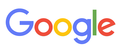
It’s no surprise that the industry leader in multimedia technology likes to be one of a kind. In 2015, Google ditched the Catull BQ serif for a custom-designed geometric sans serif typeface. Across the board, many tech brands are doing away with the decorative strokes and traditionalist vibe of serifs.
The Google logo font embodies the “less is more” spirit of today’s graphic design trends. Geometric typefaces put simplistic lines and forms in the spotlight. Product Sans showcases consistent line weights, balanced proportions, and evenly rounded circles.
Google’s top priority was versatility — something all designers should be thinking about. The uniform proportions make the typeface easy to translate across print, web and mobile media.
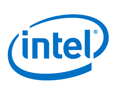
Typography legend Sebastian Lester designed the futuristic typefaces Neo Sans and Neo Tech in 2004. The following year, Intel created a custom version for its framed wordmark and branding. Neo Sans uses a sleek, square lettering that’s common for futuristic typefaces.
However, it was important to Lester to keep the font family sophisticated and legible, never gimmicky. The Intel version blends square and round letters, some of which have tapered stems or arms.
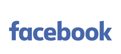
Sometimes, a font family has to evolve with the brand. Instead of going with a completely new look, many tech companies tweak their existing typeface. Until 2014, the Facebook logo font featured a custom mod of Klavika Bold. In recent years, Facebook worked with the original designer, Eric Olson, to produce the next generation. The resulting font is more rounded and trades a hooked lowercase “a” for a shorter stem.
The Facebook logo font is the perfect symbol for social technology, combining geometric and humanist styles. Humanist fonts are derived from the handwritten organic shapes of calligraphy, making them easier to read in a block of text.
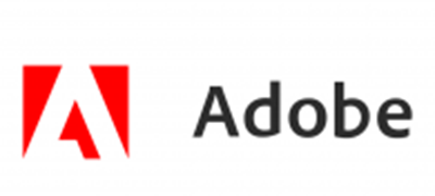
Noticing a sans serif trend? Myriad Pro Semibold is a humanist sans serif typeface custom-designed for Adobe. The adaptable design works well in everything from body text to headlines and wordmarks.
Most of the Adobe wordmark is lowercase, which lends a youthful, casual feel to the word. The letters “d” and “b” create visual balance in a short name, since they have the same ascending stroke and rounded back edge. Adobe isn’t the only big brand sporting this look. LinkedIn uses a version of Myriad Pro Bold.

Don’t be afraid to ignore trends when it makes sense. Chasing fads can backfire and weaken the brand equity of a long-standing business. Sony has stuck with the Clarendon serif typeface for years, despite the sans serif craze. It dates back to 1845 — the brainchild of British designer Robert Besley.
As a slab serif, Clarendon has thick, blocky strokes at the ends of letters. Combined with all caps, the slab serif creates a clean horizontal shape that’s pleasing to the eye. Sony has played around with thin and condensed fonts in the past, but the overall look is strong and timeless. A simple serif can add structure and impact to a short wordmark, especially for a well-established brand.
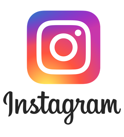
Once in a while, a tech company ignores industry trends in favor of off-beat branding. The Instagram logo font deviates from the typical modern or futuristic typeface that most technology logo designs feature.
Instead, Instagram chose to stay true to the spirit of the brand and its users with a decorative hand-drawn style. American typographer Mackey Saturday created the brand’s signature freestyle script.
Instagram originally used the Billabong script, which likely inspired the updated typeface. The newer typeface has a tidier look with continuous, unbroken lines, rather than hard transitions. The finished wordmark ends up with an even shape that reads cleanly from left to right. As a curator of graphic visuals, it’s fitting for Instagram to use a fluid, artistic font.
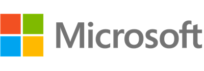
Segoe UI is the corporate font for all of Microsoft’s branding and communications. Unofficially, the font family was inspired by Adrian Frutiger designs from the 1970s. Much like Myriad Pro, Segoe is a humanist sans serif optimized for usability in a wide range of media.
The stems are slender and stark for ultimate legibility, rather than artistic appeal. The open spaces inside letters are large and crisp, while the proportions and line weights are made for clarity at various sizes.
In 2012, Microsoft went all in and redid the company logo in a Segoe typeface. Now, most of Microsoft’s software and sub-brand logos feature Segoe as well.
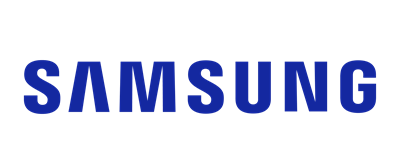
While it might look like your logo is yelling at everyone, a bold font creates a striking visual in an all-caps wordmark. Samsung uses a custom version of the DDT Condensed Semibold font to capture its forward-looking brand.
Big, bold fonts aren’t made for readability, and they quickly wear on the eyes. However, they’re well suited for short wordmarks that need to stand out on products and packaging.
Samsung balances the heavy line weight with a slightly narrow width. One noticeable feature is the signature letter “A,” which doesn’t have a crossbar. That single broken letter immediately draws your eyes, making a simple design iconic.
Tech brands can’t ignore the visual impact of words now that most engagement happens on a screen. Aesthetics and user experience are a big part of building relationships with customers. People want to feel good about the products they buy, which is difficult when the typography is harsh and off-putting.
Choose font families that are consistently clear and friendly in print or on screens. And most importantly, make sure your typeface mirrors the image you’re trying to project to customers.
Need further inspiration? Try out our free logo maker to edit logo designs, colors, and fonts.