Physical Address
304 North Cardinal St.
Dorchester Center, MA 02124

For the last few weeks, we’ve taken a closer look at how colors can enhance your brand message—from what colors mean (Part 1 and Part 2) to how color can affect the purchase behavior of your customers. It turns out, the colors you choose have a big impact on the way your customers think about your products and the way they buy them.
So what colors do the biggest brands use?
A little over a year ago, the folks at Colourlovers took a look at the logos of the 100 largest online brands to see which colors are most popular. Turns out the majority use blues and reds. No surprise there. Blue communicates trust and authority. Two very good associations for online brands. Likewise, red commands attention and represents leadership. It’s no wonder they dominate logo colors.
Another interesting find is that brands in the same category tend to use similar colors. Think Twitter and Facebook, or HP, IBM, and Dell. Similar products, similar brand colors. We often tell customers to look at the colors the competition is using and choose something different, to help them stand out. If you don’t have the brand presence and marketing budget of Twitter or Dell, this is still good advice.
Here are the results:
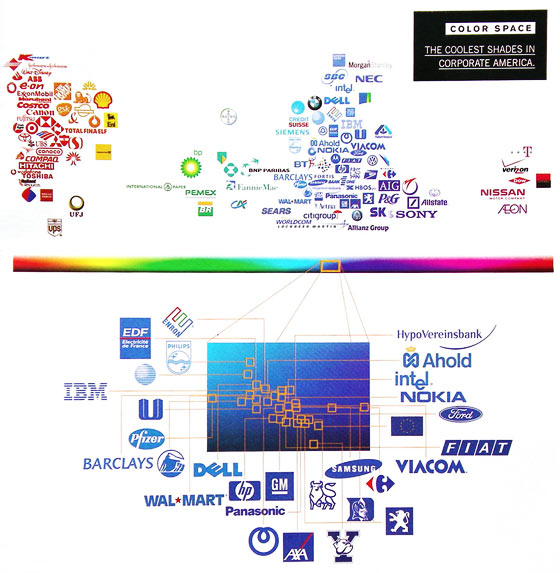
It turns out, back in 2006, the Wired Magazine took a look at the colors used by the largest companies in Corporate America. Here’s the graphic they created to go along with the story. Again, lots of blues and reds.
What’s the take away for small business owners?
First, think about what your business or product represents. What kinds of ideas or feelings do you want to communicate about what you do? Then choose the appropriate colors to reinforce those ideas (learn more about the meaning of red, blue, green, and black here and the meaning of violet, yellow, orange, pink, and white here).
Second, take a look at your competitors. Are there colors that represent the category you compete in? Do you need to use these so your customers “get” what you do more quickly, or can you differentiate yourself with a unique color combination?
Third, notice virtually all the brands featured in the infographics above use just one or two colors in their branding. Is there a color that you can “own” and that when used consistently over time can represent your company? If so, use it.
Click here to see the Colourlovers post where these graphics were found.